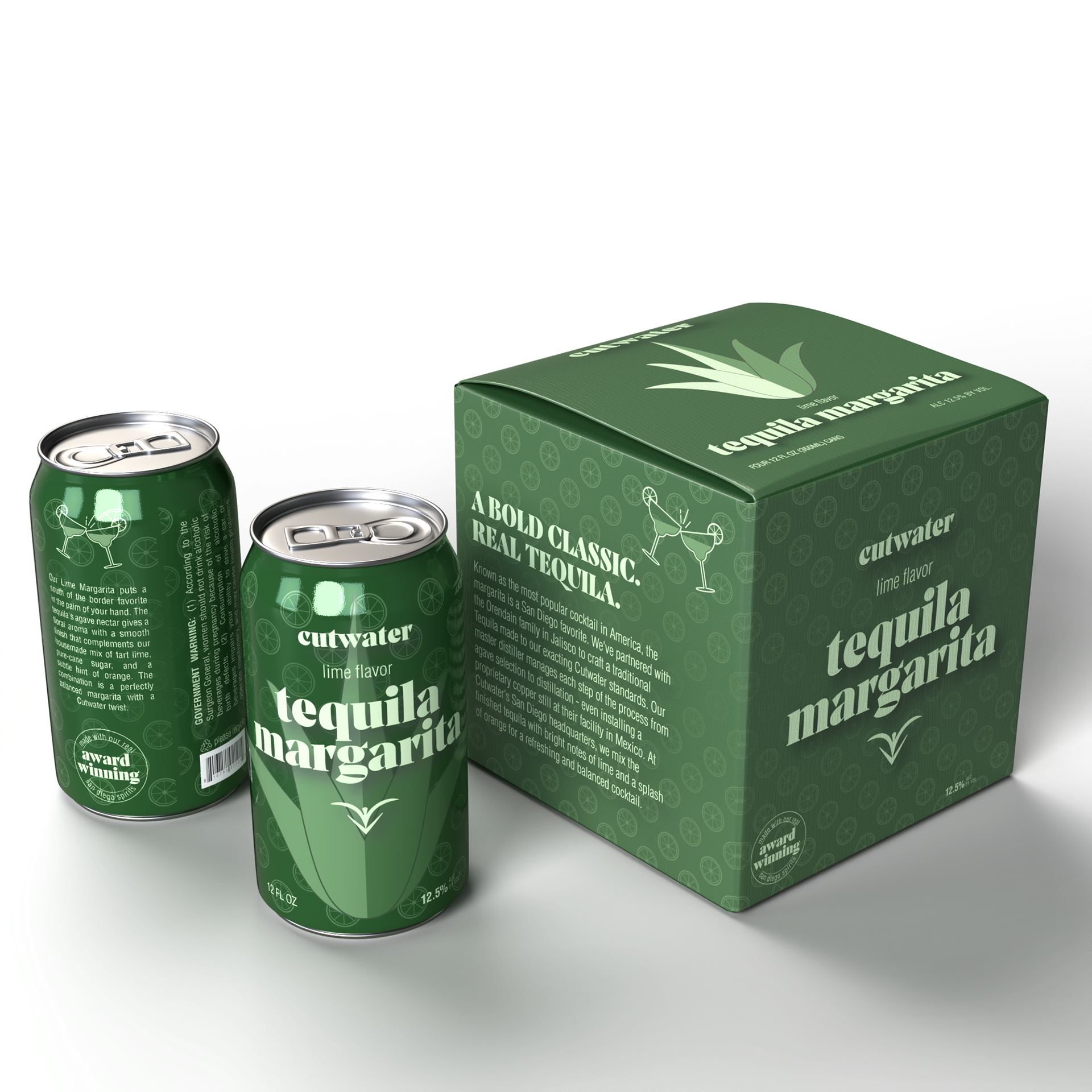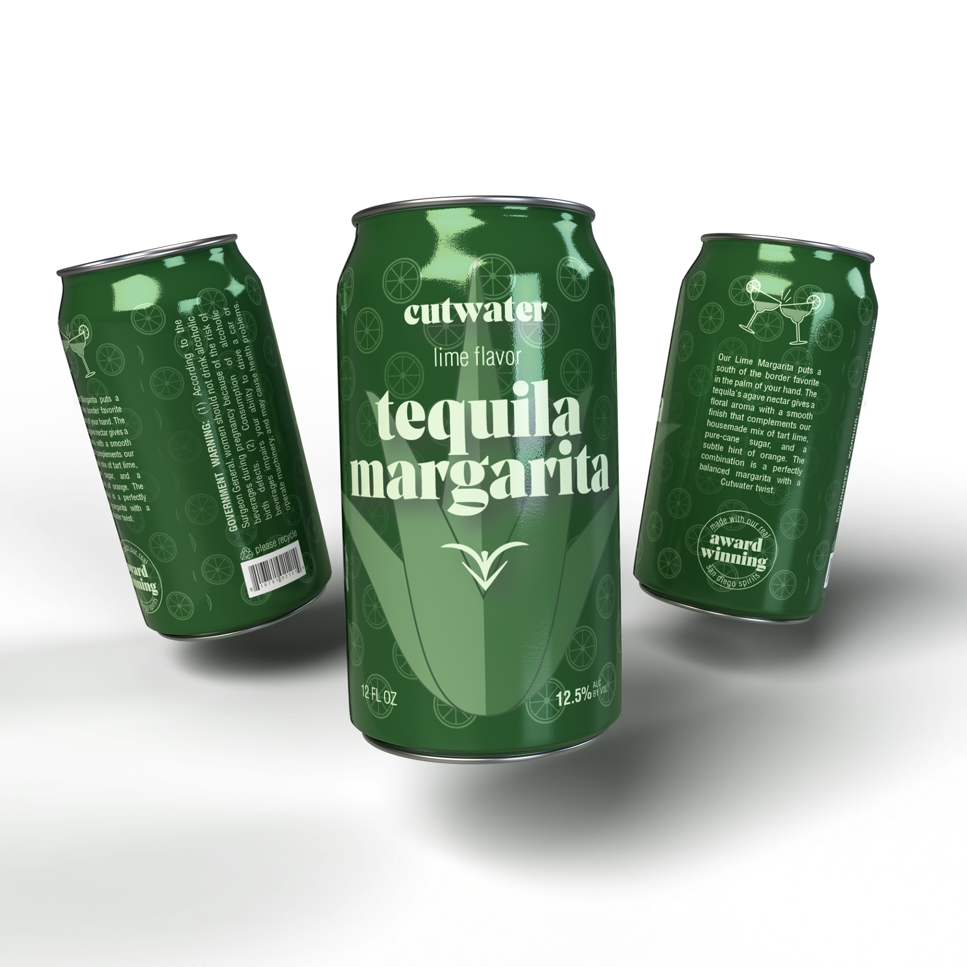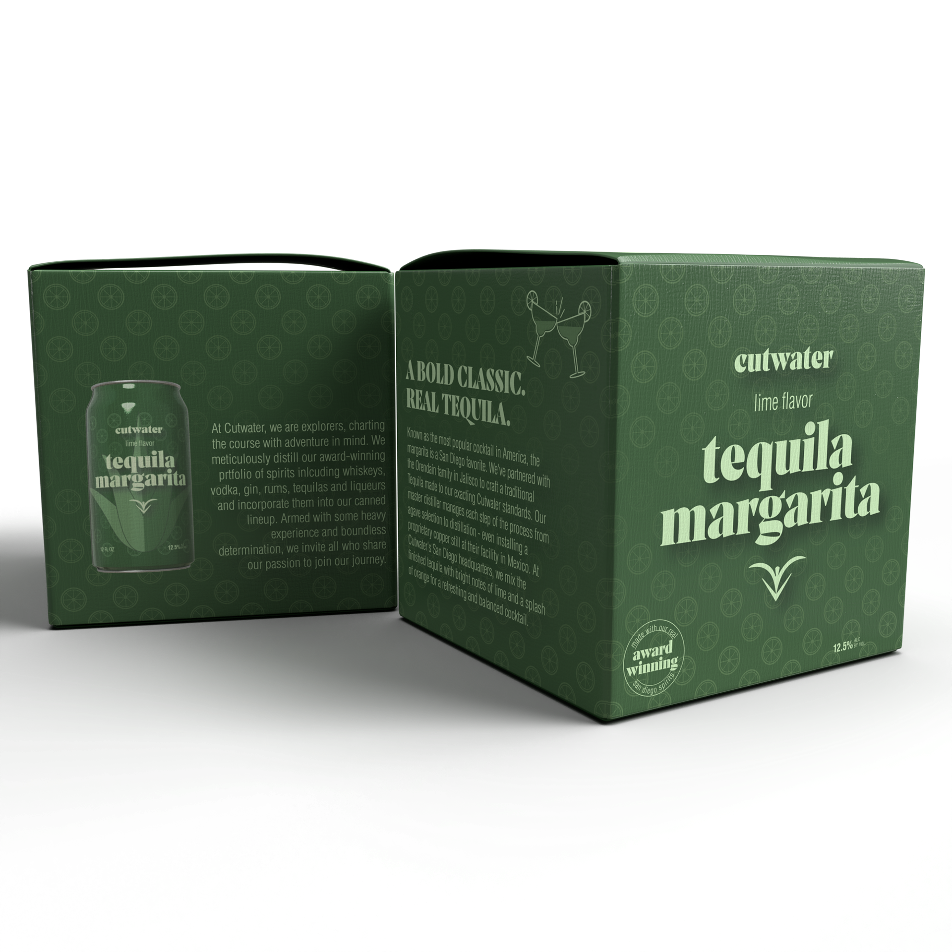
For this project, we were asked to redesign a canned drink package for an existing brand. I chose the Cutwater Margarita with my target audience being new drinkers. At first, I decided to keep the original colors but I felt it didn’t represent the drink well enough. The combination of monochromatic colors and illustrations is a way to appeal to young adult drinkers. I chose green as the main color to represent the lime but also because it is generally thought of as a calming color. The illustrations of the agave and lime are a hint at the ingredients of the drink.