For this project, we were asked to create a mid and high-tier brand, a system of flavors, and packaging for an item sold at HEB. Our challenge was to create different packaging for the same item and convey that the product is mid or high-tier through the design. The item I chose to design my package for was rice. I chose rice because I thought it would be unexpected and I wanted to challenge myself.
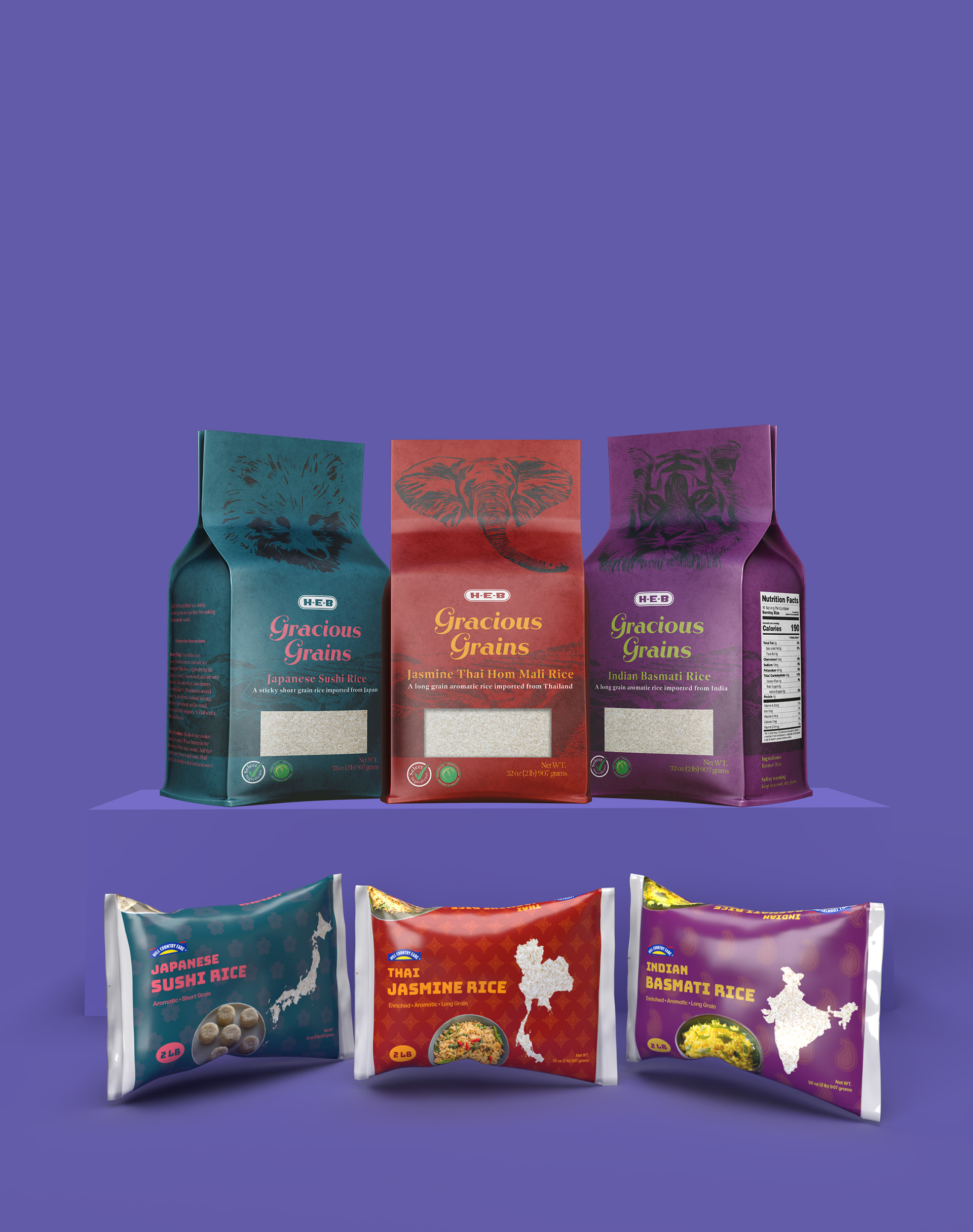
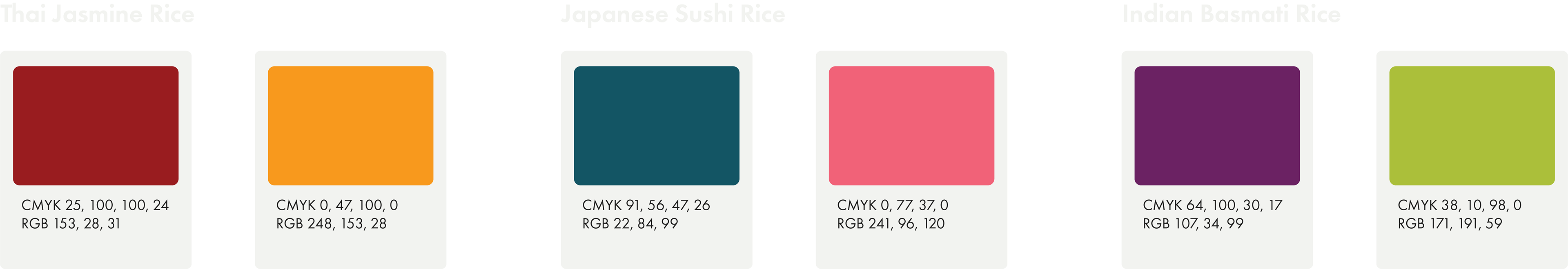
Instead of a flavor system, I designed for different types of rice. The types of rice for my system were Jasmine, Basmati, and Sushi Rice. For both packages I referenced back to the culture of where each rice is grown. They both use the same colors that reference the country.
HEB
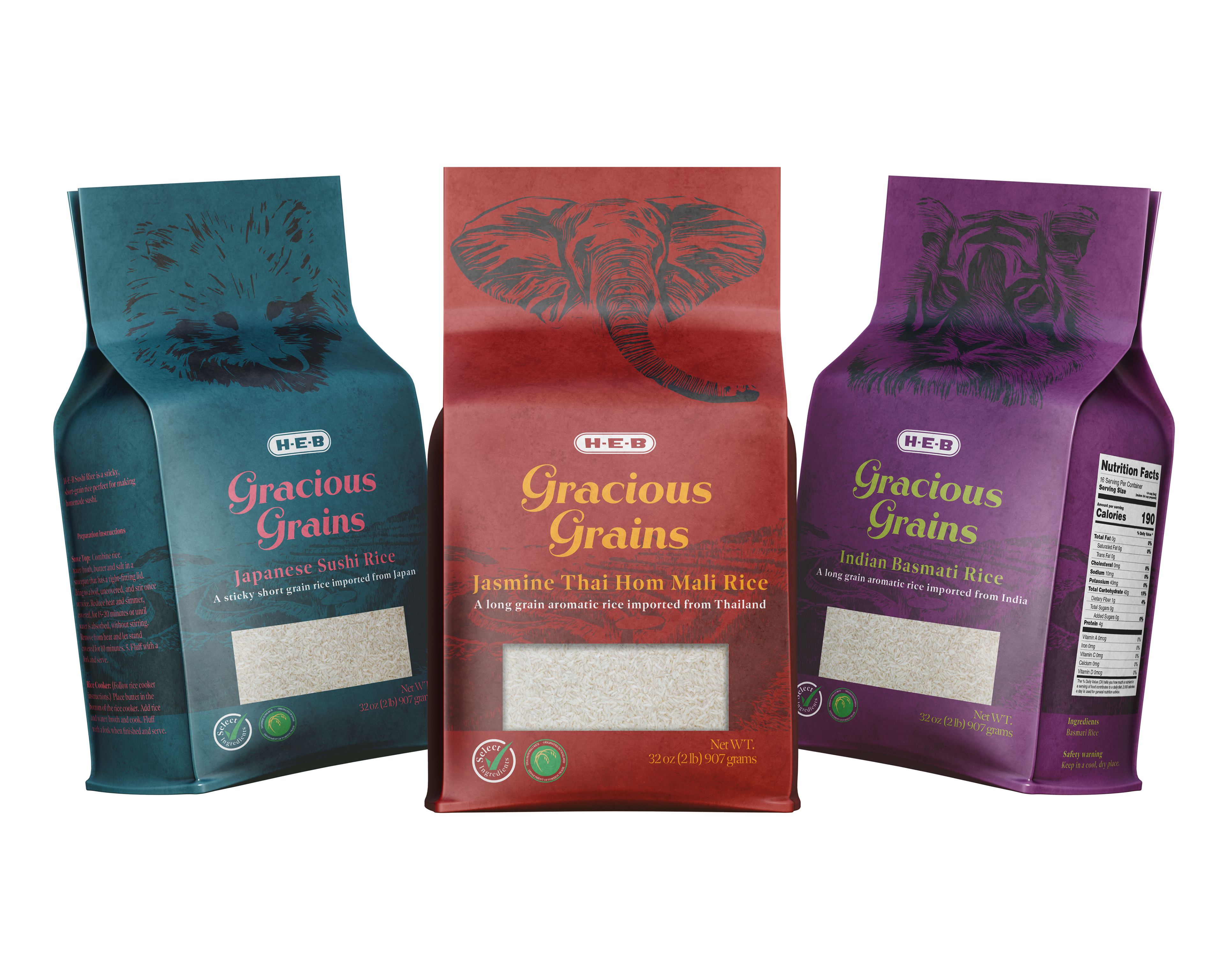
For my HEB brand, I chose the name Gracious Grains. I used Rhythm from Positype for the typeface for the Gracious Grains logotype. I did not want to have a regular photo on my HEB packaging so I used In order to call back to the country where the rice was grown I chose an animal from each country. Indian Basmati’s animal is a tiger, Thai Jasmines is an animal, and Japanese Sushi is a Tanuki. Photoshop to edit the photos to look like the woodblock style print.


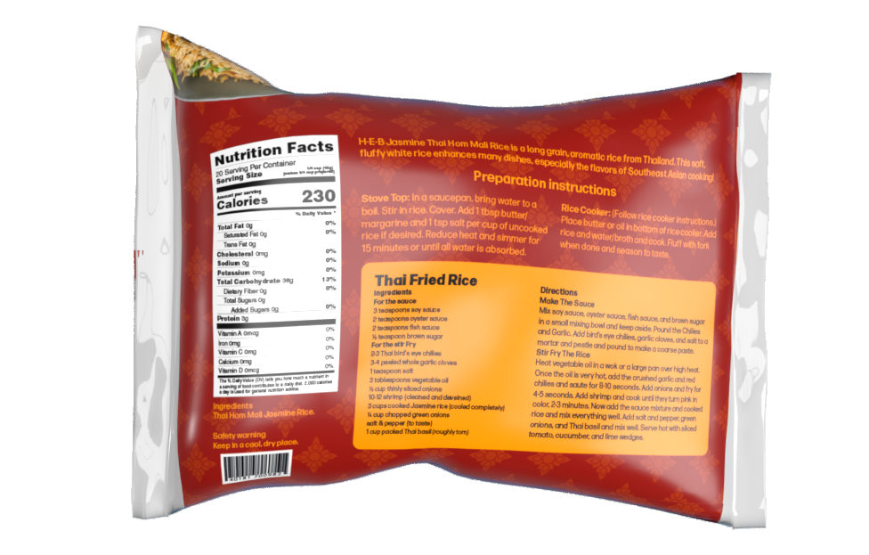
HILL COUNTRY FARE
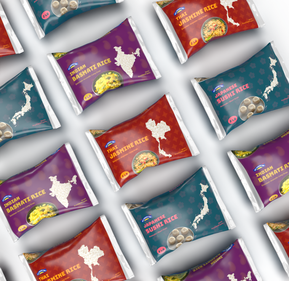
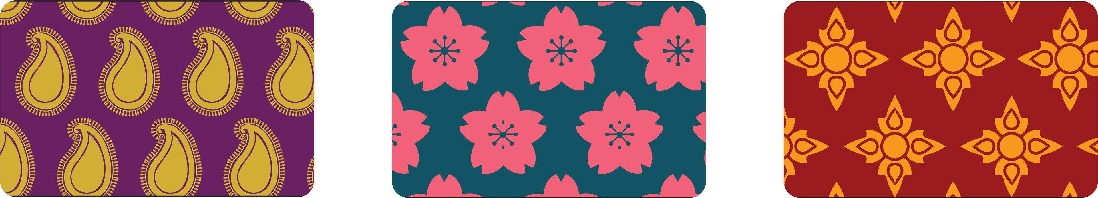
Like my HEB packaging, I wanted the Hill Country Fair packaging to call back to where the rice was grown. Instead of an animal, I used a pattern easily recognizable from that country. For India I chose the paisley pattern, for Thailand, I mimicked the flower style in their folk art, and for Japan, I used the sakura flower.